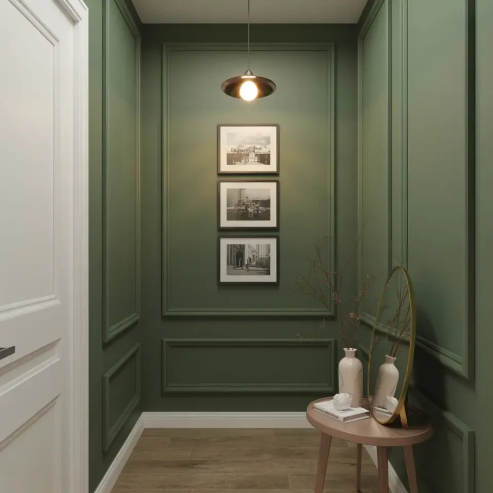
Why Most Cottage Hallway Gallery Walls Miss the Mark
If you have ever dreamed of a cottage hallway gallery wall that feels straight out of a Nancy Meyers film, you are not alone. That blend of black and white framed art, soft lighting, and quiet luxury is hard to resist. But getting it right takes more than just throwing up a few frames. I have made plenty of mistakes along the way, and I want to help you skip them. The most common problem is treating the hallway like a blank canvas instead of a curated space. When you rush, you end up with a wall that feels flat, cold, or worse, cluttered.
Let me walk through the biggest pitfalls I see and how to sidestep each one. By the end, you will know exactly how to create that heirloom inspired hallway that whispers comfort and character.
Mistake 1: Hanging Frames at the Wrong Height
I have done this in my own home, and it took me three tries to fix. You hang a frame at eye level, but in a hallway people walk through, you are eyeing the art from a different angle. The mistake is hanging too high. A hallway gallery wall should be viewed while standing, not from a seated position. Aim for the center of your grouping to sit around 60 inches from the floor.
Here is a simple test: hold a frame where you think it should go and step back. If you have to tilt your head up, lower it. In a narrow hallway, you want the art to draw the eye down slightly, making the space feel more intimate. This is especially true if you have low ceilings. Fixing the height alone transforms the whole feel.
Mistake 2: Choosing Frame Finishes That Clash With the Cottage Vibe
Black and white art sounds easy, but the frame finish can wreck the whole effect. A glossy black frame feels modern and sharp, not cozy and heirloom inspired. For that Nancy Meyers look, you want matte black, dark wood, or even a soft antique white wash. Avoid anything too shiny or bright. The frame should recede, not shout.
- Matte black gives a quiet, grounded feel.
- Dark walnut or weathered oak adds warmth without color.
- Antique white or cream works if the artwork has soft tones.
- Stay away from silver, gold, or high gloss unless you are going for something very specific.
If you already own a mix of frames, spray paint is your friend. A light sanding and a coat of matte black or chalk paint can unify an entire collection in one afternoon. Trust me, it is worth the hour.
Mistake 3: Forgetting the Soft Lighting Factor
Even the best blackwhiteart looks flat under harsh overhead bulbs. This is where many people miss the mark on quiet luxury. Soft lighting is not an afterthought; it is half the recipe. In a hallway, you cannot always install picture lights, but you can use a warm table lamp on a small console table, or battery powered puck lights directed upward from the floor.
I have a narrow hall in my 1920s cottage, and I placed a small brass lamp on a console under the gallery wall. The light bounces off the white walls and hits the frames at an angle, creating shadows that make the art feel dimensional. If you have a ceiling fixture, swap the bulb for a warm 2700K LED and use a dimmer. This simple change instantly adds that dreamy, film like atmosphere.
Mistake 4: Picking Art That Feels Too Modern or Too Busy
The keyword heirloom inspired means the art should look like it has been passed down, not printed last week. A lot of people grab generic black and white prints from big box stores and wonder why the gallery wall looks flat. Instead, look for botanical sketches, vintage portraits, architectural drawings, or simple landscapes with plenty of negative space. Avoid abstract splatters or high contrast photography.
I like to source from thrift stores and estate sales. Old bookshop prints, pages from vintage encyclopedias, or black and white photographs of empty rooms all work. If you must buy new, look for artists who use a muted, soft black rather than jet black. The goal is a soft neutral palette, so the art does not compete with the frames or the lighting. Less contrast between the white of the paper and the wall color creates a cohesive, calm look.
Mistake 5: Overcrowding the Wall or Leaving It Too Sparse
Finding the right number of pieces is tricky. Too few and the hallway feels unfinished. Too many and it becomes visual noise. The mistake is either jamming every frame you own onto one wall or using three tiny frames on a large empty space. A good rule is to fill about two thirds of the wall area with your gallery grouping, leaving breathing room around the edges.
Lay out the frames on the floor first. Start with a central piece and build outward in an organic shape, not a perfect grid. Mix sizes: one large anchor, a few mediums, and a couple small ones. In a cottage hallway, a slightly asymmetrical layout feels more collected and less curated. Step back and remove anything that feels forced. If your eye does not naturally rest on each piece, you have too many.
Mistake 6: Ignoring the Quiet Luxury of Neutral Tones Outside the Art
Nancy Meyers hallways never have bright colors competing with the art. The walls, trim, and floor should all read as soft neutral. That means warm white walls, maybe a pale greige, and natural wood or stone underfoot. If your hallway has a bold runner or bright paint, the black and white art will fight for attention. Quiet luxury comes from restraint.
I painted my hallway walls in a shade called “Swiss Coffee” by Benjamin Moore. It is not stark white, but a soft off white with a hint of warmth. The trim is the same color in a semigloss finish. This lets the blackwhiteart and the soft lighting do the talking. If your hallway already has color, consider repainting or using a large neutral rug to tone it down. The art should feel like a whisper, not a shout.
Putting It All Together for a Dreamy Hallway Gallery Wall
Now you know the common mistakes. The biggest lesson is to slow down, choose each piece and each frame with intention, and pay attention to how light and height change the mood. A cottage hallway gallery wall is not about following a formula. It is about building a collection that feels personal and lived in. Start with a few pieces you love, test the layout, and add the lighting last. You will be surprised at how much warmth one simple wall can bring to your whole home.
If you try any of these tips, I would love to hear how it turns out. Share a picture or drop a comment below. Your hallway deserves that quiet, heirloom feeling.
#hallwaygallery #blackwhiteart #nancymeyer #quietluxury #softneutral