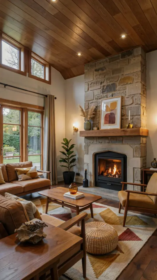
If there’s one shade I see everywhere right now, it’s clary sage paint. And honestly, I get it, that soft green-gray talks to me too. But the biggest mistake I watch people make, over and over, is picking it out in the paint aisle and then slapping it on every wall in the house with no bigger plan. That’s not going to give you a dreamy English cottage. That’s going to give you a waiting room.
Look, I’ve been there. I once painted my entire rental living room in a sage color because the swatch looked so peaceful. Three months later, the room felt cold and flat, and I wanted to redo everything. The fix wasn’t a different shade. It was a whole house color scheme. That’s what turns a pretty green paint into a timeless backdrop.
Why Clary Sage Paint Can Fall Flat Without a Whole House Color Scheme
Clary sage has a lot of gray in it. That gray is what makes it feel calm and grounded, but gray can also suck the warmth out of a space if you’re not careful. When every wall in the cottage is the same green-gray, the eye has nowhere to rest. There’s no contrast, no rhythm, no story.
A whole house color scheme gives you a thread to follow. You decide what mood you want, then you place clary sage in rooms where it does its best work, like a kitchen or a hallway. Other rooms get different shades or tones that speak to the same palette. That’s how you get a home that feels connected without being monotonous.
So before you commit to that green, pull together a simple palette on paper. A single color is a decision. A palette is a plan.
The Gold Accent Rule That Saves Your English Cottage
Here’s the thing: clary sage and gold were made for each other. Warm metallic accents cut through the gray in the paint and keep it from feeling flat. That doesn’t mean you need to spend a fortune on real gold fixtures or gilded furniture. Not even close.
I picked up a tarnished brass picture frame at a flea market for three dollars. A little polish, five minutes, and it turned that green wall into something that looked expensive. Add a honey-colored wooden shelf, a brass lamp base, or even a thrifted gold mirror and the whole room shifts. Warmth appears out of nowhere.
If you don’t want to shop secondhand, hit the clearance section at a home goods store. Look for anything in oil-rubbed bronze, antique brass, or brushed gold. It doesn’t have to match. In fact, mixed metals look more collected, more lived-in, which is exactly what cottage style should feel like.
- A thrifted gold mirror above the sofa
- Brass drawer pulls on a painted dresser
- A candle holder with a warm metallic finish on the mantel
That’s it. That’s the gold accent rule. Add a few of these and the paint suddenly works.
Deep Jewel Tones to Pair With Clary Sage
Now for the fun part. Clary sage loves a deep jewel tone standing next to it. Think emerald green curtains, a navy velvet chair, or a plum throw pillow on a linen sofa. These rich colors make the green-gray feel intentional instead of washed out.
You don’t repaint for this. You bring in textiles and accessories. I found a dark teal knitted blanket at a yard sale for five dollars and it completely changed how that corner of my living room felt. The saturated color gave the clary sage wall a story to tell.
In a bathroom, try a deep burgundy towel on a hook against a clary sage wall. In a bedroom, a dark blue headboard or a pair of mustard velvet curtains. Darker shades anchor the light green, and suddenly the whole palette feels layered and rich. That’s the English cottage vibe, right there.
A Budget Friendly Way to Sample Clary Sage and Jewel Tones
Paint samples can add up quickly. I’ve spent way too much money on tiny little jars that dried up before I ever used them. So let me save you the trouble. Instead of buying five sample pots at once, buy one sample of clary sage and one of the deepest jewel tone on your list, maybe a dark teal or a rich berry.
Paint two large pieces of cardboard, not the little poster boards, but actual flattened moving boxes. Put clary sage on one and the jewel tone on the other, then prop them beside each other in different rooms for a few days. Look at them in morning light, afternoon light, and under lamps at night.
The point is to see how they live together before you spend real money on a gallon. And if you’re really in a bind, many hardware stores sell mistint paints at a discount. I’ve used those to test whole wall colors for less than ten bucks. That’s the budget-conscious way to figure out your whole house color scheme without guessing.
Building Your Cottage Interior Design Palette Room by Room
So where does clary sage go in your whole house color scheme? Start with a common area, the kitchen or the hallway, and let that be your anchor. Then move outward. For the living room, you might use a soft cream or a warm white on three walls and reserve clary sage for one accent wall. That gives the eye a break while still keeping that green presence.
In a bedroom, consider using clary sage only on the lower half of the wall with a crisp white above. That’s a classic cottage trick, and it costs nothing extra. For a dining room, go ahead and paint all four walls in clary sage if you have those gold accents and deep jewel tones ready to balance it. A smaller, enclosed space can handle the full immersion.
Just remember to carry at least one color from each room into the next. Maybe that’s a repeat of the same white trim, or a gold frame that appears in the hallway and again in the bedroom. The connection is what makes the whole house feel planned.
Farmhouse Paint Colors That Work With Clary Sage
If you’re into farmhouse style, clary sage sits right at home next to a warm, milky white and a soft, chalky black. Think of a white farmhouse sink against a sage green island, or black window frames against a clary sage exterior. Those high-contrast, no-nonsense colors keep the green from feeling too delicate.
Another farmhouse favorite is a warm greige, a gray-beige that has more brown in it than clary sage does. Put those on opposite walls in a country kitchen and you get a lovely, grounded balance. Add butcher block countertops and a simple linen curtain and you’re basically there.
The mistake I see people make in farmhouse spaces is pairing clary sage with stark, cool white. That combination can feel clinical. Switch the white to something like a natural linen shade or even a touch of pale yellow and the warmth comes back. Farmhouse paint colors should feel like they were dug out of the earth, not pulled off a screensaver.
Don’t Forget the Trim and Woodwork
Okay, this might sound like a small detail, but the trim color is the thing that makes or breaks a clary sage paint scheme. Pure white trim next to clary sage can look too stark, almost like a hospital. Instead, try a warm off-white with a hint of cream or a soft ivory. It softens the whole look and keeps the cottage feel alive.
If you have original woodwork, do not paint it just because the mood board says so. That wood adds a natural warmth that pairs beautifully with green-gray walls. I had old oak trim in my last place and I almost covered it with white paint. I’m so glad I didn’t. The wood and the sage talked to each other in a way that paint just can’t duplicate.
But if your woodwork is in rough shape, a coat of a softer white can be a lifesaver. Just pick a shade with warm undertones. You’ll be surprised how much that changes the whole room.
So here’s the plan, friend. Grab your swatches, get a few cheap sample pots, and test clary sage next to a deep jewel tone and some gold accents. Let them hang out for a few days. Then take a breath and paint your first wall. The whole house will follow, and it’ll actually feel like something. Not just green paint, but a story. If you’ve already started painting, tell me in the comments, where did the clary sage go, and what are you pairing it with? I’m genuinely curious.
#clarysagepaint #wholehousecolorscheme #cottageinteriordesign #farmhousepaintcolors #englishcottagestyle
Leave a Comment